V1 Art Fundamentals
Ocvirk, Art Fundamentals
Chapter 1. Introduction
Art is the structured expression of a conceived image in terms of a
given medium (Cheney)
Style: Expressive character unique to an individual
(Mondrian and his influence on Rietveld and Schröder; Saint Laurent
dresses)
- Subject
Objective/Representational vs Non-Objective/Non-Representational
- Form
Spatially arranges the elements of art: line, texture, color, shape,
value
With principles: harmony, variety, balance, proportion, dominance,
movement, economy
- Content
Context-sensitive (Van Gogh, The Night Café)
“Colors as powerful as Wagner’s music”: red, green are sinful passions;
black is anguish; blue is heaven
Combination of all → organic unity (Rembrandt, Christ Presented
to the People)
Content = Subject in Conceptual art (Picasso, Bull)
Content = Form in Process art (Pollock, Blue Poles)
Subject can be remodeled by an Abstraction (Naturalism to Realism to
Semi-Abstraction to Objective Abstraction to NonObjective
Abstraction)
Some abstractions actually simplify (Picasso, Bull)
Space
| Plane |
Planes |
| Decorative |
Plastic Space |
| Positive(Field) |
Negative Areas(Ground) |
| Illusive Depth |
Actual Depth |
| Fake Mass |
Mass (glyptic) |
3D Techniques
Subtraction > glyptic materials (stone, wood, cement, clay…)
Manipulation > Clay, wax, plaster -> further technical changes to
preserve them
Addition > assembling wood, plastic, metal with bolts, staplers,
screws, nails, rivets…
Substitution > casting after another technique has created the basic
form –> For Sculpture/Bas-relief, Architecture (Dyson, Lencioni
Residence; Gehry, Disney Concert Hall in LA), Metalwork,
Glass Design, Ceramics, Fiberwork, Product Design
The total appearance, organization or arrangement of all the visual
elements, according to the principles that will develop unity in the
artwork
Media and techniques organize the elements of art (line, texture,
color, shape, value) into Harmony and Variety
–> resulting in Balance, Proportion, Dominance, Movement,
Economy
–> creating Space and Visual Unity
Harmony
Relationship and cohesion between elements, created by
similarities.
- Repetition
Can place emphasis, but can create monotony. Warhol, 100
Cans
- Rhythm
Regular alternating of similar textures, values, shapes… with visual
accents and pauses
The spacing of visual units can create visual silence (heads in
Stevovich, Internet Café)
(Hokusai,Under the Wave off Kanagawa; Ukiyo-e,
Pictures of the floating world; Manes, Eiso)
- Pattern
Repeated motif that can create an allover pattern (Escher, Rippled
Surface) Variations within the motif can become a keyvalue for the
allover pattern (Close, Paul III)
- Closure
Our mind arranges closely linked figures into bigger patterns (see
Gestalt)
- Visual Linking (these techniques blur shapes and reduce the illusion
of depth)
- Shared edges, blurred by color or value (Escher, Day and
Night)
- Overlapping of shapes (Uelsmann, rowboat, ocean, and clouds in
cupped hands; Duchamp, Nude descending a staircase)
- Transparency
- Interpenetration
- Implied Edges/Lines/Shapes They create directional impulses,
movement along invisible lines, guiding the eye through the composition
(Vermeer, Diana and the Nymphs)
Variety
Separation between elements.
- Contrast
(Jonas, Geostructure I)
- Elaboration
Variations upon a theme (Escher, Day and Night)
- Balance
Expectations when seeing a ball with negative space below vs a hot-air
balloon. Different perception of top/bottom vs left/right as in CSS.
Established horizontally, vertically, diagonally, radially (cf Shahn,
Handball)
- Symmetrical Balance
Attracts attention, but needs variety to not be monotonous
- Radial Balance
(Fraser, Black and White; Tomaselli, Bird Blast)
- Asymmetrical Balance
Uses the other fundamentals to create balance
Proportion
Comparative relationship of size. When related to a standard, it’s
equivalent to scale.
Golden Section (Polyclitus of Argos, Doryphoros, Nautilus
shell)
Mathematical proportions for the body in the Renaissance (Da Vinci,
Uomo Vitruviano)
Oversized relative to the rest (Piero Della Francesca, Madonna of
Mercy; Oldenburg, Saw, Sawing)
Dominance
Separation between elements.
- Isolation
- Placement
- Direction
- Proportion
- Character
(Piero Della Francesca, Madonna of Mercy; Spero, Artemis,
Acrobats, Divas and Dancers; Glaser, Dylan Poster)
Movement
Separation between elements.
Chapter 3. Line
The path of a moving point made visible by constrasting the
surrounding)
Describes motions (Richards, How to peel an orange);
delimits objects by creating borders where texture and value don’t blend
(Woods, Terrain 10; Kelly, Briar)
Physical characteristics
- Measure: width and length
- Type: straight, angular, curved
- Direction: the path a line takes or suggests, even
against its type. Lines sharing the same direction harmonize,
facilitates a sense of continuity
- Location: can imply unity or division
- Character
Lines and the other
fundamentals of art
- Shape: lines can be the contour or border of a shape
- Value and Texture can define lines, and lines can suggest
textures
- Cross-contour and cross-hatching define shapes and suggest
three-dimensionality
- Thick, dark lines have a different character than bright, thin
lines
- Colors can change the expressivity and perception of lines
Chapter 7. Color
The visual abstraction of different wavelenghts of light, described
with hue, intensity, and value.
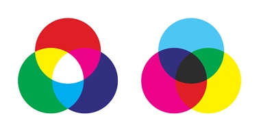
Subtractive Color
Color created by reflection of the light not absorbed by pigments on
things
Red, blue, yellow are
the subtractive primaries
Violet, green, orange
are the subtractive secondaries
Additive Color
If colored light is used, rays can be combined just like they were
dissociated by a prism. Tech screens use this principle
Red, blue, green are
the additive primaries
Magenta, cyan, yellow
are the additive secondaries
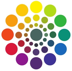
The 12 colors of the wheel can be picked in triads,
tetrads, analogous and monochromatic groups,
warm and cool groups.
Each color can be described by 3 properties:
- Hue
- Value (high-key vs low-key colors)
- Intensity (= brightness, saturation, chroma)
Kelly, Spectrum
Aesthetic Color
Relationships
Complementary colors create contrast, thus variety
Warm colors suggest closeness, and cold colors suggest distance.
(Cézanne, Apples and Biscuits. ~1880)
Placing warms in the back- and colds in the foreground creates a
decorative space (Gauguin, Vision after the Sermon)
- VALUE (the relative degree of lightness or darkness)
- high-key vs low-key: happy, light, bright mood vs sad, dark, heavy
mood
CONTRAST -> readability: lines, shapes, textures, eye movement
(using accents of the opposite key) -> drama vs harmony when high vs
low (noir movie)
BEST MEDIA FOR VALUE 1 - Etching: acid on metal, ink fills the
crevices, pressed on paper, depth of crevices determines value (Milton,
Points of Departure) 2 - Woodcuts: carved on wood, printed on paper,
closeness of determines value (Hokusai, The Great Wave) 3 - Lithography:
oil crayon on limestone, lipophile ink determines value (Toulouse
Latrec, Jane Avril) 4 - Screen printing: excluding areas to be coloured
by blocking them, preparation of the screen determines value 5 -
Photography: perfect depiction of light and shadow
PLASTICITY (spherical surfaces vs intersecting planes) - placement of
the light source can increase or decrease it (light from a side vs light
from the front) 1- Chiaroscuro + fading out further away objects
(Masaccio, ) 2- Sfumato: smoke-like value edges, even softer and subtler
(Da Vinci, Mona Lisa) 3- Tenebrism, extreme chiaroscuro -> maximum
contrast to highlight things (Caravaggio, David and Goliath)
Joshua Booty, [3/21/23 7:35 PM] DECORATION -Ignoring light source
-> no shadows -Middle ages and Asian tribes and a revive in the 19th
century (Manet, The dead Toreador) -Value is worth being the focus in a
work
VALUE PATTERN & COMPOSITION -Skeleton of the work guiding eye
movement, emphasizing subject -Thumbnails to see different effects on
the subject and viewer -Colour can distract from value pattern resulting
in a bad picture(Greve, Monet’s Water III) -Closed-value composition
confines values into shapes, easyly readable(Stevovich, Internet Café)
-Open-value composition flowing values over shape boundaries,
difficultly readable (McGraw, Mother and Child)
- TEXTURE NATURE OF TEXTURE -Surface character of a material
experienced through touch or illusion of touch -Texture engages touch,
and the expectation of touch through vision (rough, smooth, shiny,
shadowy)
TYPES OF TEXTURE -Actual texture: touch = expected touch. Papier
collé and afterwards Collage are expansions on it to add more texture.
(Picasso made the first documented papier collé. He and Braque were
cubists, an art movement developed around 1907-1912 with a focus of
showing all planes of an object at the same time) -Simulated Texture:
copying to perfection the texture of 3D onto 2D, creating illusion of
touch, trompe l’oeil -Abstract Texture: often decorative, guiding eye
movement, compositional tool -Invented Texture: have no source in
reality, can give the viewer an impression of a known texture,
decorative
TEXTURE AND PATTERN -tactile stimulation vs ornamental motives -both
are created through contrasting values -a pattern can become a texture
by entering the 3rd dimension -textures and pattern have an ideal
distance to be seen from. Changing the distance influences the work
through increasing/decreasing details
TEXTURE AND COMPOSITION -Texture can add emphasis and emotion and can
create harmony, variety and interest -Dead areas can get lively -Too
much texture can misguide eye movement
TEXTURE AND SPACE -Atmospheric perspective: blurred textured, low
contrast in the back vs sharp textures, high contrast in the front
TEXTURE AND EXPRESSIVE CONTEN -Association of textures with emotions
or experiences to enhance psychological reactions